Float Box Snippet
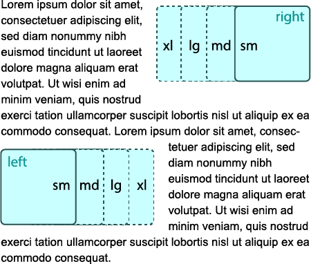
The float box snippet places content on the left or right side of the page, allowing text and other elements to wrap around it.
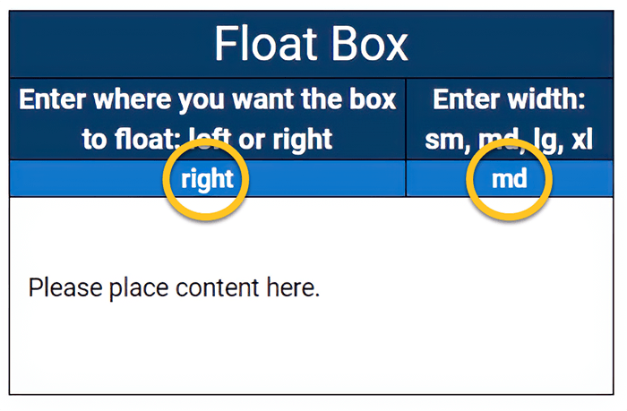
The snippet will allow for three sizes that will proportionally affect a float box width and height. These sizes are small (sm), medium (md), large (lg), and extra-large (xl). The float direction is controlled by indicating a left or right direction in the snippet.

When to use the float box snippet
Using a floatbox can enhance the visual design of a page on desktop and laptop size screens. It is often used to break up large amounts of text, or provide visual context when used with images, pull quotes, buttons, links, or brief passages of informative text.
When content is placed inside a float box, it is taken out of the normal flow of the document (though still remaining part of it). It is shifted to the left or right, until it touches the edge of the content area or another page element.
When the size of a screen becomes smaller than 768 pixels wide (phones & tablets), the float box will return to the flow of the document, and text will no longer flow around the contents of the box.
Usability guidance
Be careful not to place two float box snippets in close proximity with each other or a column snippet, as they may push against one another, creating spacing gaps on the page.

Implementation
- Open a page in Modern Campus CMS and enter editing mode.
- Place your cursor where you would like the top of the float box to start.
- From the toolbar, select the snippet icon
 , which resembles a puzzle piece.
 - From the list of snippets, select the Float Box snippet.
- Press the Insert button.
- Input the float direction and box size or leave the default values.
- Add your content.
- Save and Preview


