Infographic Component
The infographic component allows a number or text value to stand out and easily catch the attention of your visitors.
There are four design styles to fit a variety of campaign styles. Media elements include the Font Awesome library or an image file. Additionally, you may hyperlink the entire block or keep it un-linked.
Options:
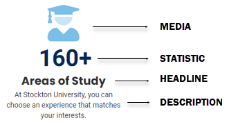
Media:
Choose between any of the FontAwesome icons or an image file. Transparent PNG files are recommended when using images.
Statistic:
Enter a number or text (limited to 10 characters). When using a valid number, a count
up animation is available.
Headline:
Bold attention grabbing text.
Description:
Text field to describe the info graphic.
Advanced Option:
The component can be hyperlinked.
Designs:
Design 1: Clean
Design 2: Border with shadow
Design 3: Black background
Design 4: Blue background
When to use the stat promo component
Use this component to highlight a number or text statistic, so it catches the attention of your visitors.
Usability guidance
You can choose between four design styles.
When entering a font awesome icon class, enter only the class name (shown in bold): <i class="fa-solid fa-users"></i>
When using an image file for the icon, a PNG file with transparency recommended.
A vertical alignment features has been made available in the advanced options of this component. This features can assist with the design enhancements when used within a column snippet.
Special Features

-
Number or Text Statistic (Limited to 15 characters)
-
Content Alignment
-
Height Matching
-
Image Support
Implementation
- Open a page in Modern Campus CMS and enter editing mode.
- Place your cursor where you would like to place an image.
- From the toolbar, select the component icon
 , which resembles an atom symbol.
 - From the list of components, select the Infographic component.
- Fill in the required fields and select your options.
- Save and preview.
