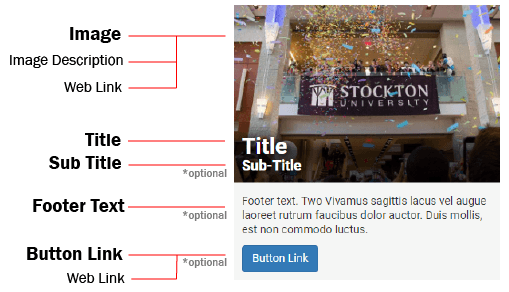
Text Overlay Tile Component
The Text Overlay Tile Component allows the creation of a linked image block with a text overlay.
When to use the Text Overlay Tile component
The Text Overlay Tile has a variety of use case scenarios where a powerful call to action is needed along with visual imagery. The component can be placed inside of a column snippet or float box snippet to achieve different layout styles.

Usability guidance
An image is required to use this component. The image should generally be no more than 720 x 480 pixels in size for optimal viewing.
When using more than one Text Overlay Tile in a row, ensure the images used have the same size dimensions.
The Text Overlay Tile must also be linked to a page or file and should not serve as page decoration.
Keep the title and sub-title on the shorter side to prevent line-wrapping.
Implementation
- Open a page in Modern Campus CMS and enter editing mode.
- Place your cursor where you would like to place the component.
- From the toolbar, select the component icon
 , which resembles an atom symbol.
 - From the list of components, select the Text Overlay Tile component.
- Fill in the required fields and select your options.
- Save and preview.
Example output with all options enabled:


